
In-Store Promotional Posters: 9 Rules to Make Them Truly More Readable
A promotional poster should not be judged on design alone. In store, it needs to be understood quickly, from a distance, in an environment filled with products, prices, colors, and competing messages.
An in-store promotional poster rarely has much time to persuade. The customer walks by, compares, looks for a price, checks a product, or crosses an aisle. If the offer is not immediately readable, the poster becomes part of the decor instead of a real communication material.
Readability does not depend only on price size or color choice. It comes from a combination of decisions: information hierarchy, contrast, reading distance, placement, format, amount of text, and consistency with the commercial operation. A poster can look good on screen and be far less effective once printed, placed on a shelf, or installed in a high-traffic area.
The most common issue
A promotional poster can be visible without being readable
At the point of sale, visibility catches the eye. Readability makes the message understandable. The two are connected, but they are not the same. A very colorful poster can be visible from far away while still being hard to read. Conversely, a more restrained material can communicate the offer more effectively when it clearly prioritizes information.
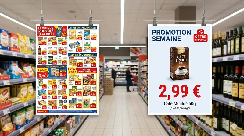
A poster with too much text, several competing headlines, a price buried in the visual, cramped legal mentions, and an offer that is hard to understand in a few seconds.
A poster with a clear promise, an identifiable price or benefit, a clear hierarchy, and a level of detail adapted to the reading distance.
The goal is not to make everything bigger. It is to decide what the customer needs to understand first, then organize the rest around that priority.
9 rules to make a promotional poster truly more readable
These rules are intentionally simple. They are useful both when creating the poster and when approving it before printing, distribution, or availability to stores.
Choose one main piece of information
A promotional poster cannot put everything at the same level. The customer should immediately understand whether it is about a price, a discount, a bundle, a new product, a loyalty benefit, or a limited-time operation.
Build a clear hierarchy
The eye should follow a logical order: headline, offer, product, useful conditions. If everything is bold, large, or colorful, nothing truly stands out.
Reduce text to what is strictly necessary
A poster is not a product sheet. Secondary details, long wording, and internal explanations should be avoided. Text should help the customer decide, not slow down reading.
Work on contrast before color
A bright color does not guarantee readability. What matters first is the contrast between the text and background, especially when the poster is viewed from far away or in an already busy aisle.
Adapt text size to the reading distance
A poster on an endcap, in a window, or on a shelf is not read the same way. The greater the distance, the shorter, more readable, and more clearly structured the message needs to be.
Do not bury the price in the visual
If the price, discount, or benefit is the trigger, it needs to be immediately visible. It should not compete with too many images, pictograms, or secondary mentions.
Plan real breathing room
White space, or more broadly empty space, is not wasted space. It helps the eye isolate important information and makes the poster more comfortable to read.
Check legal mentions without crushing the message
Offer conditions need to be included when necessary, but they should not overpower the main information. Their placement should be planned from the creation stage, not added in a hurry at the end.
Test the poster in its real context
Approval on screen is not always enough. Ask how the poster will be seen: at what distance, with what lighting, next to which products, and among which other materials.
Pre-distribution check
Questions to ask before sending a poster to stores
A poster can follow the graphic guidelines and still be ineffective in the field. Before sending it to stores, a few very concrete questions help avoid the most common mistakes.
Mini-check before approval
Is the main message understandable in just a few seconds?
Does the offer remain readable at the real viewing distance?
Does the format match its placement: shelf, window, entrance, or checkout?
This check is especially useful in store networks, where the same material can be adapted across several formats or used in different contexts. A poster that is very readable in A3 can lose effectiveness in a smaller format if the hierarchy has not been adapted.
Mistakes that make a promotional poster less effective
Most readability issues come from good reflexes taken too far. Teams want to inform, so they add text. They want to catch the eye, so they multiply colors. They want to highlight the offer, so they add several messages. The result: the poster loses its main role.
- Adding too much information because “everything is important.”
- Using several competing headlines on the same material.
- Placing the price, discount, or benefit in a low-visibility area.
- Shrinking legal mentions at the last minute instead of planning their placement.
- Reusing a web or catalog visual without adapting it for print.
- Approving the poster only on screen, without thinking about reading distance.
If a poster needs a verbal explanation to be understood, it is probably too complex. In store, the material needs to carry the message on its own, without asking the customer for extra effort.
What Toucan® brings to promotional poster creation
In a store network, the point is not just to create a good-looking poster. Teams need to produce materials that are consistent, adaptable, readable, and quickly usable by store teams. This is exactly where templates, product data, and content management become useful.
Toucan® lets teams create posters from interactive catalogs or product databases, then design visuals through an integrated module. Teams can work from more reliable frameworks, limit data entry errors, and keep promotional materials consistent.
The value is also operational: a poster that is well structured from the start is easier to adapt, better suited to in-store formats, and leaves less room for last-minute corrections.
A readable poster respects the customer’s time
An in-store promotional poster does not need to be complicated to be effective. Above all, it needs to respect point-of-sale reality: limited attention time, many competing messages, and often quick decisions.
Readability is therefore a strategic choice. It requires prioritizing, simplifying, and choosing one clear focus. The easier the offer is to understand, the better the material does its job: helping the customer spot an opportunity, compare information, or take action.
A good poster does not add noise to the store. It makes the message more obvious.
Create posters that are more readable, more consistent, and easier to adapt
Toucan® helps retail brands design promotional materials from templates, interactive catalogs, or product data. A more reliable way to produce clear, consistent in-store posters tailored to field operations.
Explore Toucan®FAQ - In-store promotional posters
An effective promotional poster presents a clear offer, is quickly readable, fits its placement, and can be understood without additional explanation.
You need to prioritize information, limit text, work on contrast, adapt element size to reading distance, and avoid competing messages.
Priority should go to the information that makes the offer understandable: price, discount, benefit, product concerned, time period, or essential condition.
A poster can catch the eye with color or format, but still be hard to understand if it contains too much text, unclear hierarchy, or insufficient contrast.
Yes. Toucan® lets teams create posters from templates, interactive catalogs, or product data, helping produce more consistent materials that are easier to adapt.