
In-Store Poster Formats: A4, A3, Window Posters, Shelf Talkers... How to Choose Based on Your Goal
The right poster format does not depend only on available space. It depends above all on the message, the reading distance, the customer’s attention span, and where the material appears in the shopping journey.
Choosing an in-store poster format often seems simple: A4 for small messages, A3 for promotions, large formats for windows, shelf talkers to catch the eye on the shelf. In the field, it is a little more subtle. The same message can work very well in one format and become unreadable, too discreet, or too intrusive in another.
Format is a communication choice. It tells the customer whether the message is practical information, a priority offer, a commercial event, decision support, or a wayfinding cue. It should therefore be chosen based on the goal, not just based on habit or the template available.
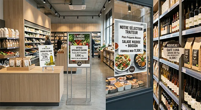
First decision point
Before choosing a format, clarify the role of the material
An in-store poster can attract, inform, guide, reassure, compare, or trigger a decision. It cannot always do all of that at the same time. Choosing the format becomes easier once the main role is clearly defined.
Choose a larger format, with little text, strong hierarchy, and a main piece of information that is immediately identifiable.
Choose a format close to the shelf, more direct, with short information: benefit, price, new product, tip, or range cue.
A format closer to the customer, such as a small poster or counter display, can include slightly more information without hurting readability.
The right reflex is to start from the reading context. A customer crossing an entrance does not read like a customer stopped in front of a shelf. A window message does not work like a message placed next to a product.
A4, A3, window poster, shelf talker: which format for which goal?
Each format has its natural use cases. The table below helps you choose faster, while keeping in mind that content, placement, and readability remain decisive.
| Format or material | Main goal | Best in-store use |
|---|---|---|
| A4 | Inform at close range. | Practical message, offer condition, service information, small poster close to a product or counter. |
| A3 | Give an offer more visibility. | Shelf promotion, product highlight, local operation, message readable from a medium distance. |
| Window poster | Attract from outside or from the entrance. | Commercial highlight, seasonal operation, very short message, clear promise, and strong visual. |
| Shelf talker | Create a stopping point on the shelf. | New product, product benefit, range cue, short offer, visual signal directly linked to the product. |
| Counter display | Explain or remind during an interaction. | Service, sign-up, warranty, loyalty program, additional information viewed up close. |
The farther the material is from the customer, the shorter the message should be. The closer the material is, the more detail it can provide. The format should follow this simple logic.
Do not just choose a format, choose a reading distance
Reading distance is often the most concrete criterion. An A3 poster can be perfectly readable from a few feet away and become too dense in a busy entrance. An A4 can be enough near a product, but invisible if the goal is to guide or attract.
The customer is walking, looking quickly, and may not stop. The format needs to carry a short headline, a visible price, or an immediate cue.
The customer is already close to the material. The message can be slightly more detailed, as long as it remains structured and easy to scan.
This distinction avoids many mistakes. A window poster should not look like a product sheet. A shelf talker should not carry a full sales pitch. A counter display should not be designed like a large entrance campaign.
Use cases
How to choose the right format based on the communication goal
In an in-store campaign, the same message can sometimes be adapted across several formats. But each adaptation needs to serve a specific purpose. It is not about copy-pasting the same visual everywhere.
To announce a key commercial moment
Formats that are visible from far away are the most suitable: window posters, entrance displays, large posters, or A3 depending on the space available. The message should establish the operation in just a few words. The goal is to attract attention, not explain everything.
To highlight a shelf promotion
A3, small posters, or shelf talkers are often more relevant. The material should be close to the product and clearly state what makes the offer attractive: price, discount, bundle, new product, or concrete benefit.
To guide customers toward a service
The format depends on the journey. If the service needs to be noticed from far away, a larger format can help. If the message supports an interaction with a sales associate or at checkout, a counter display or nearby small poster will feel more natural.
To reinforce a store network operation
Consistency across formats becomes important. The customer should recognize the same campaign, even if the message is adapted between the window, the aisle, and the counter. The adaptation should preserve the identity while adjusting the level of detail.
Common mistakes when choosing poster formats
Mistakes often come from the wrong trade-off between visibility, readability, and the amount of information. A larger format does not always fix a message that is too dense. A small format is not enough if the customer needs to see it from a distance.
Using the same visual across all formats
A window poster, an A4, and a shelf talker do not have the same role. Reusing the exact same visual everywhere can create text that is too small, cropped visuals, or hierarchy that is poorly adapted.
Choosing the format after creation
The format should be considered from the start. If the material is adapted at the end, legal mentions, images, price, or headline may lose readability.
Forgetting store constraints
A format can make perfect sense on paper, but be hard to install in certain aisles, too large for the available space, or not very visible depending on lighting and product surroundings.
What Toucan® brings to format selection and adaptation
For a retail brand or store network, choosing a format is not just a graphic design decision. Teams need to produce materials that are consistent, adaptable, usable by stores, and suited to current operations.
Toucan® lets teams create posters from interactive catalogs or product databases, then design visuals through an integrated module. This approach helps teams work with templates, adapt messages to different formats, and limit inconsistencies between materials.
When an operation needs to exist as an A4, an A3, a shelf material, or complementary screen content, the challenge is to keep the same consistency while adapting the message to each use case.
The right format serves the message, not the available space
Choosing an in-store poster format means answering a simple question: what should the customer understand, and under what conditions will they see the material? From there, the choice between A4, A3, window poster, or shelf talker becomes more logical.
An effective format is not necessarily the largest, the most visible, or the one most often used by habit. It is the one that makes the message understandable at the right moment in the customer journey.
In a store, every material needs a reason to exist. Format is one of the first levers that makes that reason clear.
Create materials adapted to every in-store format
Toucan® helps retail brands design, adapt, and organize their in-store posters using templates, interactive catalogs, or product data. A simpler way to keep materials consistent, readable, and suited to field use.
Explore Toucan®FAQ - In-store poster formats
The right format depends on placement, reading distance, and the goal. A3 is often suitable for a shelf promotion, while a window poster is better for attracting attention from outside or from the entrance.
A4 is suited to information viewed close up: offer conditions, service messages, product-adjacent signage, counters, or advisory areas.
A3 is useful when a message needs more visibility at a medium distance, for example a promotion, a local operation, or a product highlight in an aisle.
A shelf talker attracts attention directly on the shelf. It is useful for signaling a new product, an offer, a product benefit, or a range cue.
Yes. The same message often needs to be adapted differently depending on the format, because reading distance, available space, and the role of the material are not the same.