
In-store digital signage: what content should you display based on screen placement?
A screen in the storefront, aisle, checkout area, or reception area does not serve the same purpose. To be useful, it needs to show the right message in the right place, with the right level of detail.
In-store digital signage is effective when it starts from what happens on the floor. A screen should do more than display an attractive visual or animation. It needs to answer a specific situation: where the customer is, what they are looking at, how much time they have, and what information they need at that moment.
At the entrance, a screen can set the tone for the current sales campaign. In the aisle, it can help customers understand a product range or compare use cases. At checkout, it can remind them of a service, warranty, or loyalty benefit. In the storefront window, it needs to get straight to the point, often without sound, for people passing by the store.
Digital signage content should be selected based on screen placement: storefront window, entrance, aisle, checkout, reception area, waiting area, or advisory space.
In a high-traffic area, the message should be short, visual, and easy to understand. Near a product or decision point, the content can be more explanatory, more useful, and more focused on helping customers choose.
Starting point
In digital signage, placement defines the role of the content
The same message can work very well in one part of the store and lose its value somewhere else. An offer visible right at the entrance can encourage customers to head toward an aisle. But if that same offer is displayed far from the relevant product, it may be forgotten before the purchase happens.
This is even more true for explanatory content. It is useful in an advisory area or near a product that needs a bit of education. But it becomes too long for a storefront window or an area where customers move quickly. The right content therefore depends on the message, the placement, and the customer's mindset.
Attention span
A passerby, an aisle customer, and someone waiting in line do not have the same amount of time to read and understand a message.
Customer intent
Depending on the area, the customer may be discovering, comparing, waiting, looking for information, or completing a purchase.
The screen's role
A screen can attract, guide, inform, reassure, inspire, or support a service. Its role changes depending on where it is placed.
Before preparing a playlist, start with one simple question: what should this screen do, here, in this specific area? Catch the eye? Help customers choose? Make waiting time feel shorter? Remind them of practical information? The answer then guides the content, pace, and message length.
What content should you display in each store area?
Each placement has its own constraints. The best content is not necessarily the one that highlights an offer the most. It is the content that fits naturally into the customer journey and responds to a real in-store need.
In the storefront window: capture attention in just a few seconds
The storefront window often speaks to people who have not entered the store yet. The message must be visible from a distance, understood very quickly, and clear enough to create a pause, a glance, or a desire to come inside.
- Key commercial or seasonal moments.
- New arrivals, collections, and event-based campaigns.
- Highly visual messages with minimal text.
- Simple offers that are easy to understand from outside.
In a storefront window, the content should work without explanation. A strong image, a short message, and a clear hierarchy will be more effective than a dense or overly promotional visual.
At the store entrance: guide customers and announce priorities
The entrance sets the tone. It is often the first contact point with the current commercial atmosphere. The screen can announce a campaign, highlight a new product, direct customers to an area, or remind them of an important service.
- Presentation of current campaigns.
- Welcome messages or practical information.
- Highlights of departments or areas to explore.
- National or local key moments.
In the aisle: help customers choose and enhance the offer
In the aisle, the screen should stay connected to the purchase decision. It can help customers understand a range, compare use cases, highlight a product, or remind them of a benefit. The content should relate to what the customer has in front of them, or very close to it.
- Choice, usage, or product pairing advice.
- Highlights of a product range or new arrival.
- Simple educational content.
- Reminder of a promotion related to the aisle.
At checkout: use waiting time without overloading it
The checkout area is a specific zone. The customer is waiting, but they are also at the end of their journey. Content should therefore remain short, useful, and unobtrusive. It is a good place to remind customers of a service, loyalty benefit, upcoming campaign, or practical information.
- Loyalty program, services, warranties, or customer benefits.
- Reassurance messages or practical information.
- Simple last-minute offers, as long as they remain easy to read.
- Communication about upcoming campaigns.
In a waiting area or advisory space: explain more
In a waiting area, advisory space, or counter area, customers often have a little more time. Content can therefore be more educational, as long as it remains visual, well paced, and easy to follow.
- Simple demonstrations or product benefits.
- Care, usage, or preparation tips.
- Presentation of complementary services.
- Inspirational or reassuring content.
Decision table: what content should you display based on placement?
To avoid overly generic playlists, the simplest approach is to define a logic by area. This helps headquarters, communication teams, and stores choose content using the same criteria.
| Placement | Screen role | Most suitable content |
|---|---|---|
| Storefront window | Attract attention and encourage people to enter. | Key moments, new arrivals, simple offers, highly readable visuals, seasonal campaigns. |
| Store entrance | Present commercial priorities and guide the customer. | Current campaigns, welcome messages, services, areas to discover, practical information. |
| Aisle | Help customers choose and strengthen offer visibility. | Advice, simple comparisons, product benefits, range highlights, promotions related to the aisle. |
| Checkout | Make waiting time valuable and remind customers of useful messages. | Loyalty, services, warranties, upcoming campaigns, short and easy-to-understand offers. |
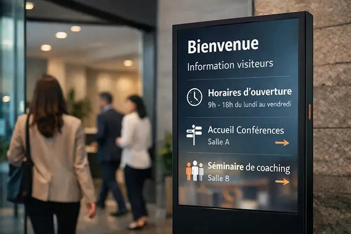
| Reception area | Inform, reassure, and guide. | Opening hours, services, order pickup, customer information, institutional or practical messages. |
| Waiting area | Explain, inspire, and maintain attention. | Usage advice, demonstrations, inspirational content, complementary services, product storytelling. |
This table is a working foundation. Each retail brand can adapt it based on its sector, store size, customer journey, and the role screens play in its communication.
Operational method
How do you build a playlist adapted to each placement?
A good playlist is not just a sequence of visuals. It needs a pace, a logic, and real consistency with the area where it is displayed. The goal is to avoid the "catch-all" screen, where every piece of content runs everywhere with no clear hierarchy.
- Define the role of the screen. Attract, guide, inform, sell, reassure, or support the waiting experience.
- Limit the number of messages. An overly long playlist reduces the real visibility of each piece of content.
- Adapt text density. The more traffic an area gets, the shorter the message needs to be.
- Plan broadcast dates. Outdated content on a screen quickly creates the impression of poor control.
- Leave room for local messages. Some screens need to include store-specific needs.
A good practice is also to sort content by type: national campaign, local promotion, practical information, product advice, service message, sales event, or institutional communication. Once this sorting is done, it becomes much easier to place each piece of content on the right screen.
Common mistakes when choosing screen content
When a digital signage setup performs poorly, the screen itself is rarely the issue. Most of the time, the difficulty comes from the content, pacing, or lack of management.
Displaying the same content everywhere
A message that works in the storefront window is not necessarily effective in an aisle, at checkout, or in a waiting area. Each placement requires its own reading level.
Using too much text
An in-store screen is often read while customers are moving. Long sentences and overloaded visuals quickly lose effectiveness.
Forgetting the message lifespan
An expired offer, old campaign, or outdated seasonal message weakens the credibility of the setup.
Ignoring sound constraints
In many stores, screens run without audio. The message must therefore remain understandable visually.
Content designed for a printed poster, catalog, or social network does not automatically work on a screen. It often needs to be simplified, paced differently, and adapted to the available reading time.
Content management
What Toucan® brings to placement-based content management
Toucan® helps retail brands organize their in-store communications with greater consistency. The challenge is not just creating a visual or sending it to a screen. Above all, it is about structuring content according to formats, uses, and placements.
The software lets teams create posters from interactive catalogs or product databases, design visuals through an integrated module, then broadcast playlists on in-store screens. This continuity makes it easier to organize print and digital content around the same campaign.
Create
Prepare materials and visuals adapted to in-store communication, with consistent and controlled content.
Adapt
Adapt messages based on areas, screen formats, campaigns, or point-of-sale needs.
Broadcast
Organize screen playlists to match content with the right in-store placements.
For a store network, this logic helps strike the right balance. Headquarters maintains campaign consistency. Stores, meanwhile, can access content that is better adapted to their on-the-ground reality.
The right content always depends on the store context
In digital signage, there is no such thing as content that works everywhere. A good message appears in the right place, at the right time, with the right level of detail. That is often what makes the difference between a screen that is truly noticed and a screen that eventually becomes invisible.
Before producing a new playlist, the store floor should guide the choices: where is the screen located? How long can the customer look at it? What should they understand or do next? The content comes after these questions, not before.
In-store digital signage becomes truly useful when it respects the customer journey. Storefront window, entrance, aisle, checkout, or waiting area: each placement deserves its own content, priorities, and broadcast rhythm.
Structure your screen content according to the right placements
Toucan® helps retail brands create, adapt, and broadcast their in-store content, from printed posters to screen playlists. It is a simpler way to adapt messages to each point-of-sale area and maintain consistent communication across the entire network.
Explore Toucan®FAQ: In-store digital signage
In the storefront window, it is best to prioritize short, visual, and engaging messages: key moments, new arrivals, simple offers, or seasonal campaigns. The content needs to be understood quickly from outside.
In the aisle, content should help customers choose: usage advice, product benefits, product range highlights, new arrivals, or promotions directly related to the products near the screen.
It is not recommended. The same message can lose effectiveness if it is not adapted to the placement, available attention span, and customer intent in the relevant area.
You need to limit the number of messages, define one priority per area, plan clear broadcast dates, and remove content that does not directly support the customer journey.
Yes. Toucan® lets teams create visuals, adapt them to specific needs, and broadcast playlists on in-store screens to align content with point-of-sale use cases.